Project Pixl: Creating a unique set of icons for the Zomato app
Earlier this year, there was increasing consensus that our app had begun to look a little cluttered and dated. So we got to the drawing board and kickstarted our efforts to overhaul the Zomato user experience, and make it simple again. This involved revisiting various aspects of the app — from a product designer’s perspective, it included everything from loading screens and restaurant pages to fonts, colours, and icons. Since the home screen is a user’s first interaction point with the app, we figured that is where we should begin.
For a while now, we’ve had quick-search buttons on the home screen, allowing users to find great suggestions for breakfast/lunch/dinner or restaurants serving the most popular cuisine in that city, with a single tap.
But that’s where a large part of the problem was. In addition to dominating the home screen, there were a few things wrong with these quick-search buttons that we knew we needed to fix –
The heavy background image and white text made for poor readability; the buttons being clustered together made them harder to tap, too.
They looked too ‘old school’ for an otherwise new-age product.
They were distinctly lacking in character.
Most significantly, they were inconsistent with the visual style of the rest of the app.
A simple way to make these buttons easier on the eye (and on the finger) was to give each one a distinct visual identity. Increasing the padding between them and adding a subtle corner radius was on the cards anyway, but we still needed to get around the readability issue.
The solution? Give each cuisine its own unique and identifiable icon, while building a universal language that would connect them all.
The first step was to make a list of all the cuisine icons we’d be creating, and how we’d capture the essence of each one in the most understated way we could. We had to be mindful of what each element in the icons would represent, while also ensuring they would scale across multiple geographies and cultures. This is where having colleagues from over 30 countries an email away came in really handy — we had reference images (and explanations) of dishes and cuisines in a matter of hours 🙂
Before we got down to the hard part (of actually creating these icons), we decided there were a few ‘rules’ we’d have to follow:
The visual style would need to lay a foundation for future iconography and illustrations.
We’d need to follow a standardised system that would allow for other designers to step in and be able to create icons themselves at any time.
Our icons and illustrations would all need to have the right ‘voice’ — a clear mood and tone that would communicate cleanly with users.
They would need to strike a fine balance between being deliciously attractive, while not being too overbearing on the app screen.
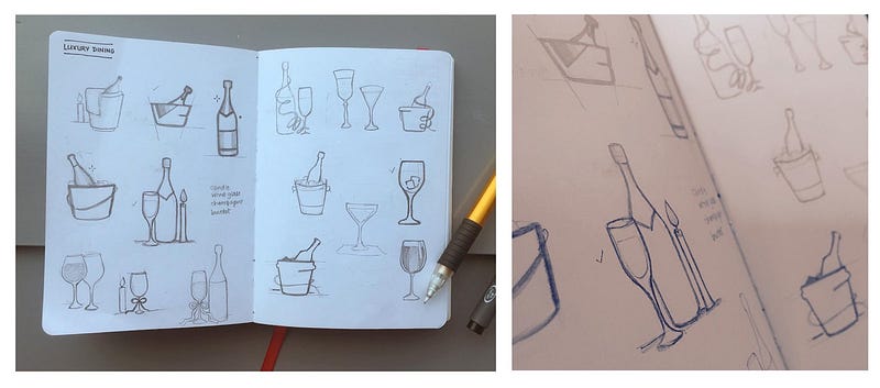
Next came the paper sketches, which were a great way to shape our thoughts and work towards identifying a style that worked.
Some of our initial pencil sketches (these were hard work, but fun to do, and saved us a ton of time in the long run)
After (quite) a few iterations, we finally had a style we loved, and we’d identified the elements we’d use to create each icon.
Shapes
We started off designing our icons using basic geometric shapes, and then adding elements to them. This helped maintain symmetry and consistency, while also helping ensure that the icons looked like they came from the same family.
Our ‘Microbreweries’ icon (or as our rhyme-y copywriter insists — “How we drew the brew”)
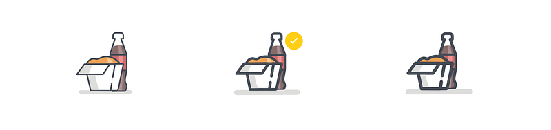
Stroke width
This was one of the most interesting parts of the icon design process. While it might not seem like a big deal, even a slight change in the stroke width can completely change the visual impact an illustration will have. We needed these to be clean and attractive, and still have enough of a presence on the screen. In the end, a 5-pt stroke width helped achieve this beautifully.
L to R: Too little, just right, and ‘please get out of my face’
Proportions
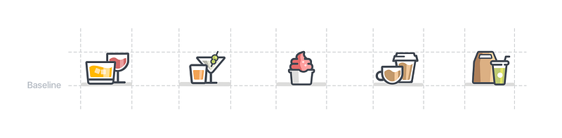
Not all icons are created equal, and finding the correct proportions to accommodate so many different shapes was easily the most challenging part of the process. Adding a baseline helped give it direction, and once we had defined a grid into which our icons would need to fit, it was smooth sailing.
Defining the grid size for the icons
Colour palette
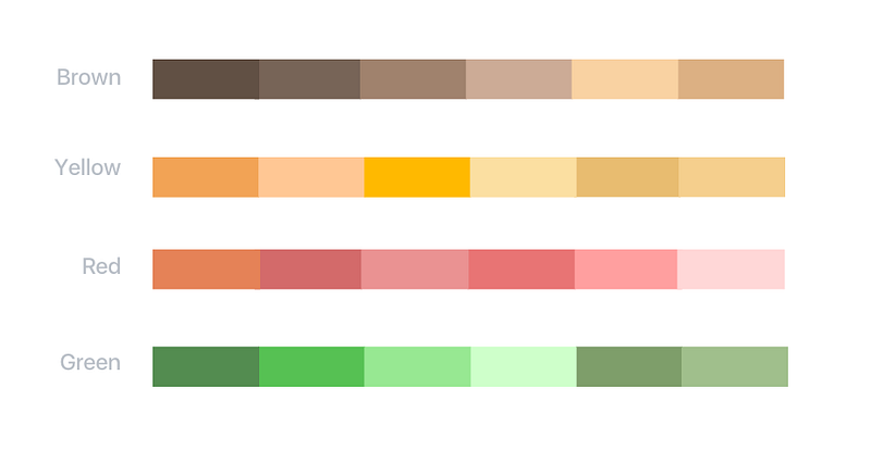
We needed something that would add just the right splash of colour without being too distracting. After tinkering with hex values for a bit, we had a colour palette everyone was happy with.
The colour palette we finally ran with
Shadows
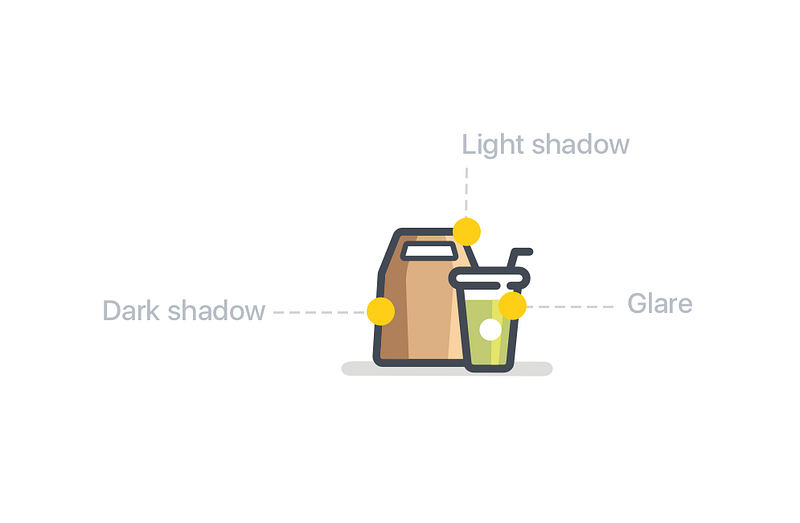
To add depth to our illustrations, we played around with reflection and shadow accents, while being careful not to overcomplicate the design. We eventually narrowed it down to three accent styles — light shadows, dark shadows, and glare.
Depth, because completely flat design and drop shadows are so 2013
Composition
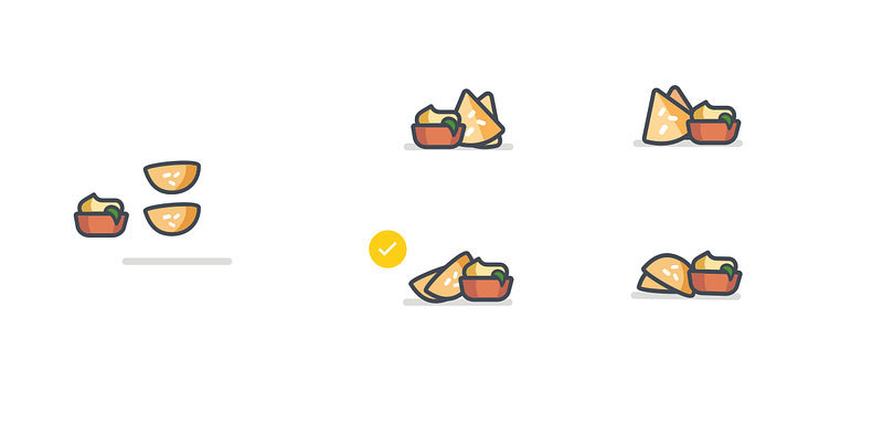
It was fascinating to see how tiny tweaks to elements completely changed the overall effect of the finished product. We won’t lie — we didn’t take a particularly scientific approach to this, instead going with what looked and felt right (and what everyone loved the most in our internal surveys).
Hummus on the left? Hummus on the right?
And finally, after a few weeks of hustle (and ordering in dinner far too many times), we had a set of beautiful, created-from-scratch icons that looked good enough to eat…
Don’t attempt to eat these
…and an app that looks great, and is really easy to use.
Don’t attempt to eat these either
You’ll find these icons peppered throughout our iOS and Android apps — we’d love to know what you think of them (and of our app in general, of course). Give us a shout at feedback@zomato.com — we read everything we get 🙂
P.S. We’ve got some ‘icon’-ic* goodies (a printable version of the poster at the top of this post + wallpapers for your desktop) we’d love for you to have. They’re right here on Dropbox.
*Sorry, our punny copywriter got to spend way too much time on this post
Charu is a product designer at Zomato. After graduating with a degree in design from NIFT, she spent some time at Adobe as an experience designer. She is often found doodling ideas and icons, and she loves to travel in her free time.
Local Preview is a developer productivity tool that enables local machines to connect to the service mesh. It allows us to test new features on the app, within seconds, without waiting for continuous integration/continuous delivery (CI/CD).
Espresso is our open-source PDF generation and signing solution. It delivers PDFs in under 200 milliseconds while reducing server costs by 90%. Built on Go and Chromium, it’s fast, scalable, and now available to the community at large.


